
Use data visualization software to convert textual and numeric data into a visual format like charts or tables. Create applications by bringing up importance to data using such visualization software. Capture data and analyze it to report performance or operational statistics from a system. It can work as standalone software or as part of an IT system. After you collect, process, and model data, visualize it to make conclusions with the help of visualization software. Visualization helps to identify patterns in a large set of data quickly. Universally communicate information using visual information. This software helps to absorb information to improve insights and make faster decisions.
1. SISENSE
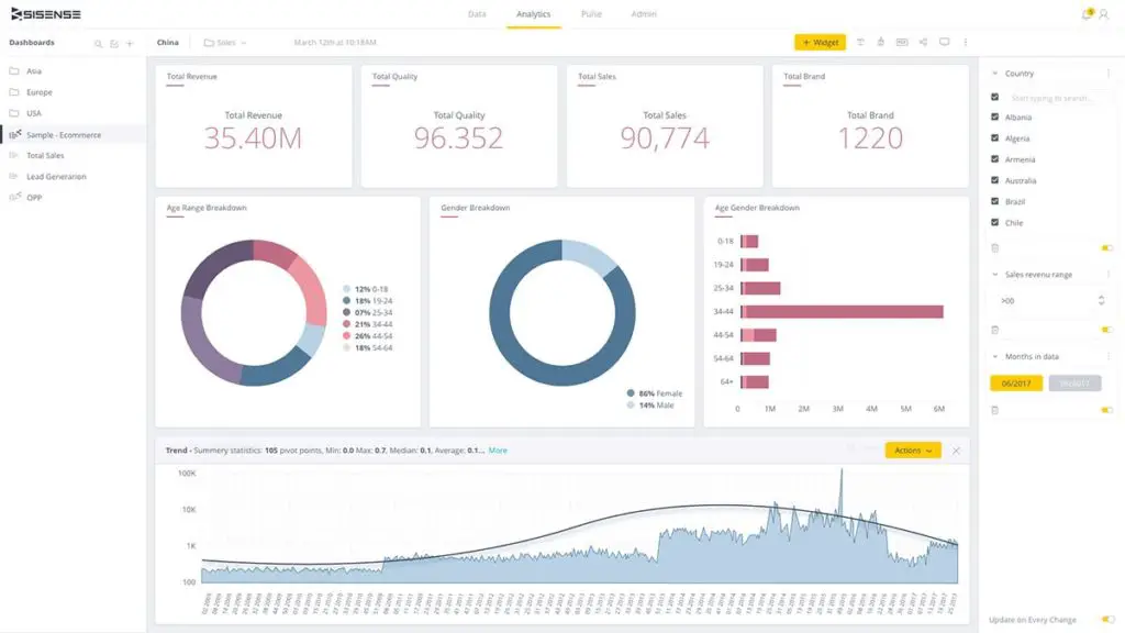
Sisensedata visualization software gives you a graphical way to represent your data. It will allow you to communicate large data sets. Visualize data in various forms like graphs, maps, and many more in a single dashboard. It acts as a self-service Business Intelligence Software solution allowing all data visualization tools to be easy to use. Use the tools available in Sisense to understand your data in an interactive way. Connect directly to any data source and present your data in the format of your choice. Non-technical people can use this software easily. Assemble all data in the final dashboard and share it across your organization.
2. LOOKER
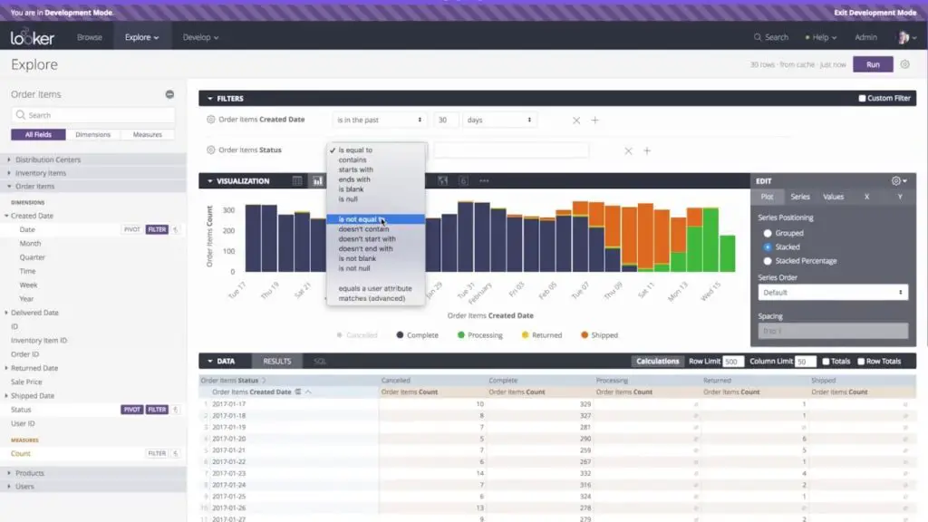
Turn a massive amount of data into a readable form using visualization tools. Looker allows you to analyze data deeply to give accurate results. Create beautiful visualizations to make impressive dashboards. Make your dashboards interactive and dynamic using this software. Make compelling presentations with the guide available. This software contains various formats representing your data like timeline, donut multiples, Sankey, treemap, and many more. You can even create your own data visualization format using JavaScript and save it to Looker. One visualization format will not help to analyze the data and hence, drill through charts to get every detail from your data.
3. ZOHO ANALYTICS
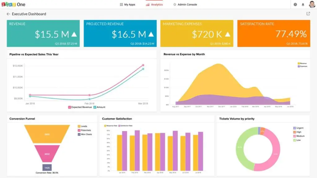
Get data from multiple resources and blend them to create reports using Zoho Analytics. Blend and merge data from different sources to create your business report. Create dashboards with an easy interface of the software as you can simply drag and drop the tools. Use various visualization tools to get specific data. Use Artificial Intelligence-powered analytics to auto-generate reports from your data. See future trends from your past data. Collaborate your reports with your colleagues online and add comments. Get alerts when anomalies happen. Synchronize data automatically and upload data from a spreadsheet or any type of file. Feed-in data from any online storage service like Google Drive to analyze them.
4. REVEAL
Reveal helps to integrate data analysis into your application easily. Create beautiful dashboards using the drag and drop interface of Reveal. Access data anytime, anywhere from any device using this software. Create a visualization of your data and annotate them. Make your team member’s data experts as everyone can now create visualizations within minutes. Access your data securely in real-time using this software. Connect to local spreadsheets and SQL databases to visualize your data quickly. Visualize your data using different chart types of charts. Identify key data points through screenshots of the visualization and export dashboards to share with others. Get the paid version to enjoy more benefits of this software.
5. TABLEAU
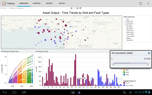
Connect your data with external sources like government policy. Tableau has a step-by-step guide to help you through your data visualization process. You can start using Tableau’s free trial and buy the paid version if you want to continue using it. Find hidden insights in your data using this software. Use Machine learning and natural language feature available in this software to make analytics more approachable. Type your questions to get a response in the form of data visualization using Tableau. IT organizations can manage data across the organization with the help of this software as users quickly find the data they need for analysis.
6. DOMO
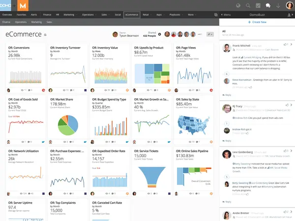
See data from any part of your business using Domo. Build your dream dashboard by putting all critical information into a single dashboard. Analyze the big picture as you can see all your data from any platform in Domo. It will help you to make informed decisions better. Enjoy the automatic update feature where you do not need to waste time creating manual reports from your visualizations. Domo is available on mobile phones, too, allowing you to use it from anywhere. Get a consolidated view of your data and share real-time stories about your business. Upload a data source onto DOMO and get suggestions on which type of visualization to use for your data.
7. QLIKVIEW
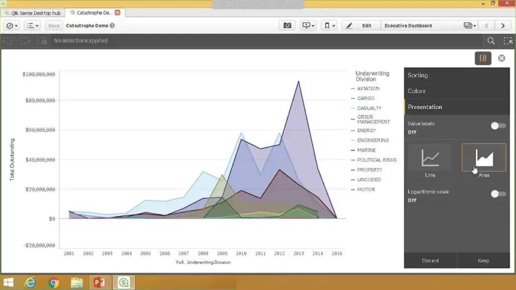
QlikView helps government agencies to show data to its citizens. Citizens will make decisions based on the data shared in different visual formats. It helps to improve operations and reduce costs for the agency. Combine internal and external data sources using this software. The machine learning capability of this software allows the formulation of multiple scenarios to predict the outcomes. This data analytics platform helps improve government services and saves budget as you can analyze all activities like emergency response conditions and service improvements. Visualize crime-related points and track expenditure of government using this platform. Make smart visualizations of data to analyze it and make informed decisions using this software.
8. KLIPFOLIO
Present your data visually using Klipfolio, and import your data easily using this software. Get a trial version of this software free for 14 days. Visualize marketing trends and accounts easily using this software. Raw numbers are difficult to understand and take time to analyze. This data visualization software helps to turn your raw numbers into graphs or other visualization formats to reveal trends. It helps to predict your outcomes and get a glance at the performance of your business, and use filters to analyze specific parts of your data. Use the pre-built visualization template to make customized visualizations of your data. Execute complex formulas and solve challenging problems using this software.
9. IBM WATSON ANALYTICS
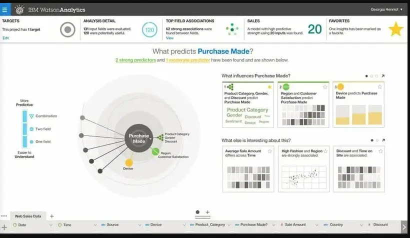
Explore data from different perspectives using IBM Watson Analytics, which makes visualization of data easy. Identify patterns, relationships, and connections in a large amount of data easily. A three-dimensional chart display option is available for better visualization. Errors bars are present to indicate uncertainty in data. Display data as Heat map charts in various colors to show activity levels. Multi-chart display option is available to display data up to four combinations to analyze it better. Get the frequency distribution of a variable using population pyramid charts. Analyze all the different data types in various formats to get your desired outcomes, download these details, and save it in image format.
10. FUSIONCHARTS
FusionCharts allows you to apply configurations to the data after receiving it from the data engine. Configure your charts to your choice using FusionCharts Suite. Compare values by plotting bar graphs. You can even add or edit chart titles to enable viewers to understand the topic better. Users can change the number format between global or European format. Legends are available with charts as it increases understandability. Make tooltips for viewers to see information quickly. Insert trendlines to chart and draw attention to important parts of the chart—export charts as images. Use your brand logo to make charts. Use events and API to customize your charts on the way they behave to the actions of users.


