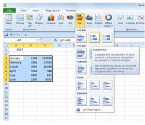
How To Create Stacked Bar Chart In Excel For Multiple Variant Values?
Asked By
0 points
N/A
Posted on - 10/23/2017

Hello everyone,
Please help me through the process of creating a stacked bar chart in Excel. I have records of sales of every month of different years, and I’m little confused in comparing, so I thought of creating it, and the best chart I found was stacked bar graph, but I’m having some issues. So please guide me through the steps.


