
I have some data available of my assignment. I have to draw graph using excel, but I don't know how to do it.
Can you guys help me by explaining the process of drawing the graph from the available data?
How to draw graph using Excel?
Keneth,
Here are steps in making a graph together with sample pictures. Hope this will help you out.
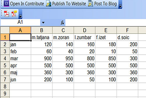
1. Type the data on the spreadsheet on the columns and rows as shown on the image below:
2. Highlight the cells that you wish to appear on the bar graph. Select the column and row labels by pressing Shift + Up or Down to highlight it.

3. Press F11 key to make a graph on the chart sheet. This is a spreadsheet page inside the workbook to display the graph.

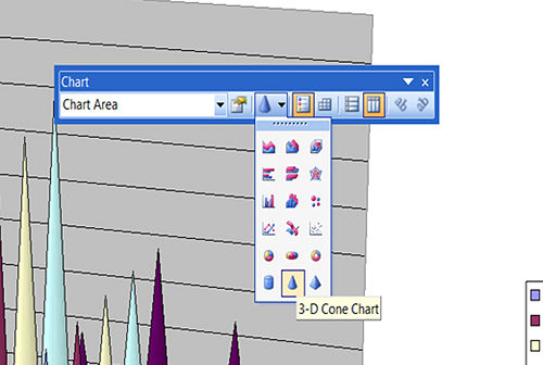
4. Under the Chart toolbar, which appears after your chart was made, click on the arrow next to the Chart Type button and click on the Bar Chart button.
How to draw graph using Excel?
Step 1: Start -> go to all programs->and select MS excel
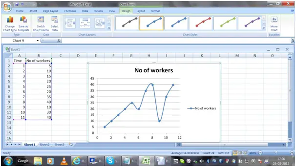
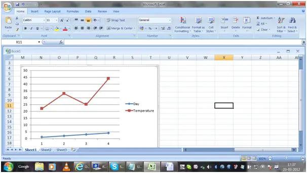
Step 2: Key in your data, say column A= X axis and column B= Y axis(please refer the sample below)

Step 3: Now select the A & B Column – > go to the insert menu -> choose the type of chart you want and you will get the data organized as a chart (please refer the sample chart below)
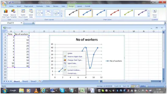
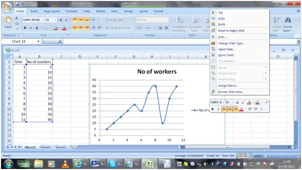
Now your chart is ready. It will be easy for you to change the attributes of the chart now. For that you have to right click on the chart and format the chart.
There are different types of chart available. I have few suggestions in which situations each chart type can be used.
Column Chart – it is used to show the changes in data over a period of time or for comparisons among items.

Line Graphs – are used to plot changes in data over time. Example : weekly change in temperature.
Pie Chart is used to emphasize on a significant element in the data. The data is represented in the form of a pie.

Bar Graph – helps to compare among individual items.
Area Chart – displays the magnitude of change over time.
Scatter Graphs – Line and scatter graphs are similar, but in scatter graph the points are scribbled and lines are connected to display the data. Example: to indicate the marks of students.
If you wish to make changes in the fill, border color, border styles, shadow, 3D effect, then right click on the chart and choose format chart area.
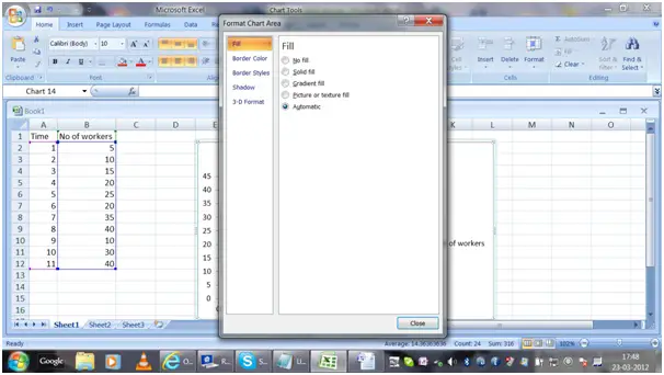
If you click on format chart area you will get a screen as shown below:
The chart is linked to the data and the graph so whenever you change the values the chart will also get updated.
Usage of MS excel in preparing charts is easy and saves time, so Happy chart preparing using ms excel.


