Tweeter has changed its logo. It is almost same to the older one. But the newer one is vivid and more eye catching. Can anyone tell what hidden theme does the new logo represents?
What hidden theme does tweeters new logo represent?
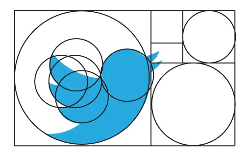
The certifiable explanation for these thoughts isn’t any of the above and perplexing; the basic truth is that utilizing this routine can bring about a decently equalized, constant piece of work of art.
There's totally nothing more to it than that, notwithstanding what you may get a notification from radical fashioners who think outright excellence is as effortless as utilizing a mystery recipe.
In the event that Twitter had haphazardly drawn the bends by hand for the fledgling, the level of arch could be conflicting from line to line.
Utilizing several loops as the essential directs in any case, the whole logo has a sort of clean, effortless look that makes it works fabulous as a mark symbol.
What hidden theme does tweeters new logo represent?
During the 2012 unveiling of the latest redesign of the Twitter logo, Doug Bowman, Twitter’s former creative director, said “Twitter is the bird, the bird is Twitter.” Unlike the previous logo that has a tufted head and sometimes accompanied by the company name, the new logo resembles a mountain bluebird with a drop of hummingbird thrown in.
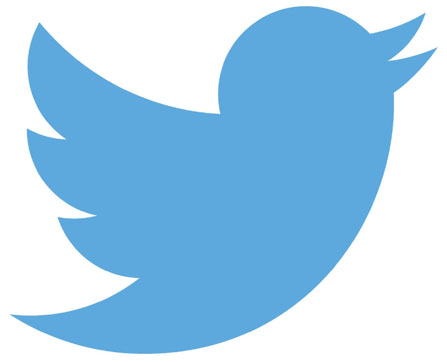
Twitter Bird
It now has a beak and body that point toward the sky in what Bowman called “the ultimate representation of freedom, hope and limitless possibility.” The current logo is simply known as the “Twitter Bird,” unlike the previous versions when the company was launched in 2006 where all of which were named “Larry the Bird” after the Boston Celtics legend.
Simon Oxley, a British graphic designer who has since produced many mascots for online companies, created the original “Larry the Bird,” to which the present icon bears a little resemblance. The blue bird was just one design he offered for sale on the iStock website in 2006 where someone at Twitter bought it for around $15.
But since companies are not allowed to use iStock images as official logos, Twitter later left Oxley’s bird behind. The original design for the first in-house bird logo of Twitter was done by Biz Stone, a company founder. They came up with the initial design then fine-tuning it by 2009 with the help of a designer named Philip Pascuzzo.
After a year, they created another version of the logo, where its cartoonish features silhouetted away, which was eventually further streamlined by Bowman into its present form.
I’m not a tech geek. I don’t keep up with every new gadget launch. I fly a few times a year, watch many movies on my phone, and live in a small apartment where...
With 2025 just around the corner, it is time to start thinking about what tech trends will be coming our way. Tech moves at a rapid pace. Some things may pop up next year...
Choosing the right Linux virtual private server (VPS) is a critical decision that can greatly impact your online projects, whether you’re running a website, hosting applications, or setting up a development environment. With various...
The finest laptops are powerful enough to do your daily tasks, comfortable enough to use all day, and power-efficient enough to ensure you don't run out of battery power unexpectedly. Of course, all these...
Before getting into knowing the facts, let’s have a brief about the Dark Web. The dark web is the data of the World Wide Web that is accessible only through special software, combinations, or...
While looking for a chemical-free way to clear and purify both durable and low grounds in your home, a steam cleaner is an excellent solution. With a spurt of superheated steam, this cleaning equipment...
Internet monitoring software keeps a log of all internet activities. You can install this type of software on your computer remotely or by the administrator. An operating console controls this software. This type of...
A Hard Disk Drive is usually partitioned into various smaller drives for optimization. A partition manager helps make this process easier and more efficient. Here, let’s discuss the top 10 best partition manager software.
1....
Music production is the initial stage of any song. Music production can be done either in studios or at home using an online music production software. Here, let’s discuss the top 10 best online...


