Hi, I would like to learn more about the Stacked Column Chart in Excel and would like to know where and in what ways it is used. Please reply in simple words. Thanks in advance.
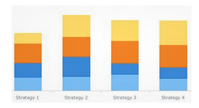
Stacked Column Chart In Excel And Use Case
Hi, to answer your question, Stacked Column Chart is a type of Visualization where different series of data is boxed over one another. This type of Visualization is done to represent various data in columns for easy comparisons. Some of the pros are it allows for easy comparison of data points whereas cons are it makes it difficult to use when large datasets are involved.